First, we recommend that you create two menus from the Shopify admin - navigation, one for the desktop and one for the mobile.
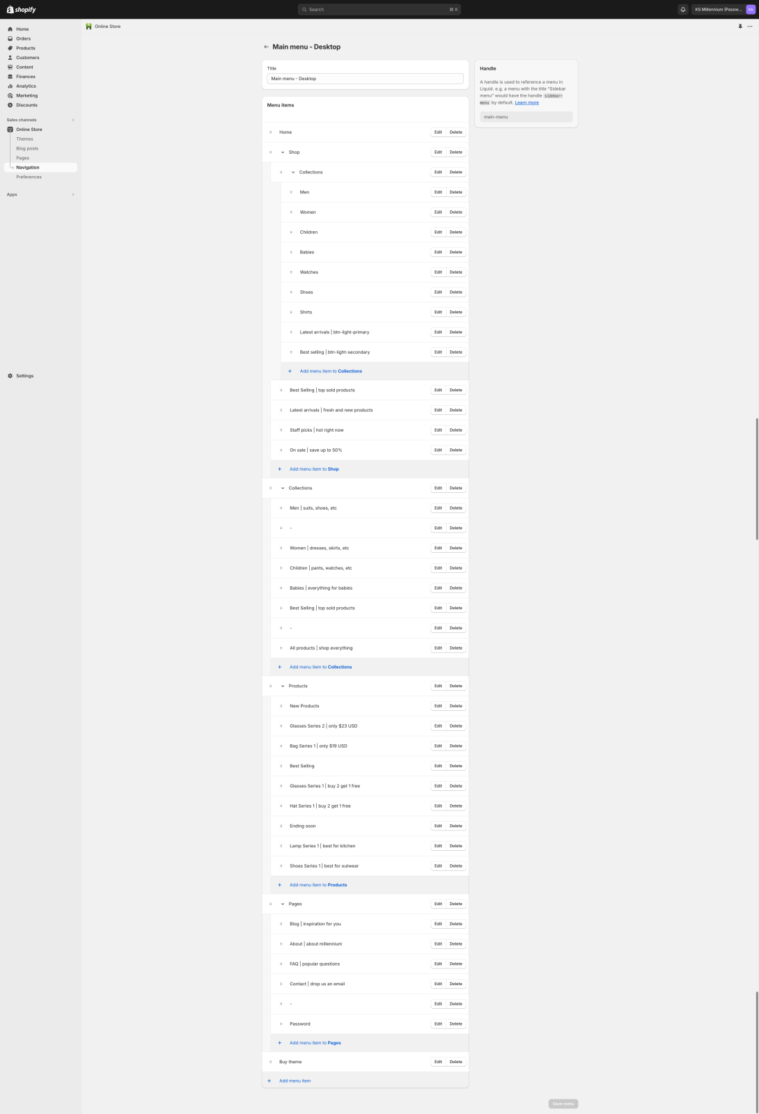
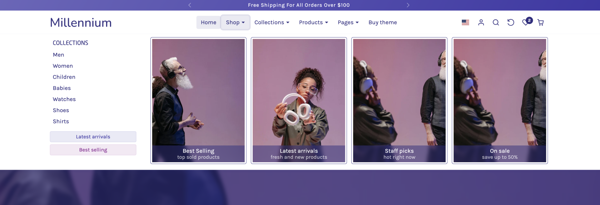
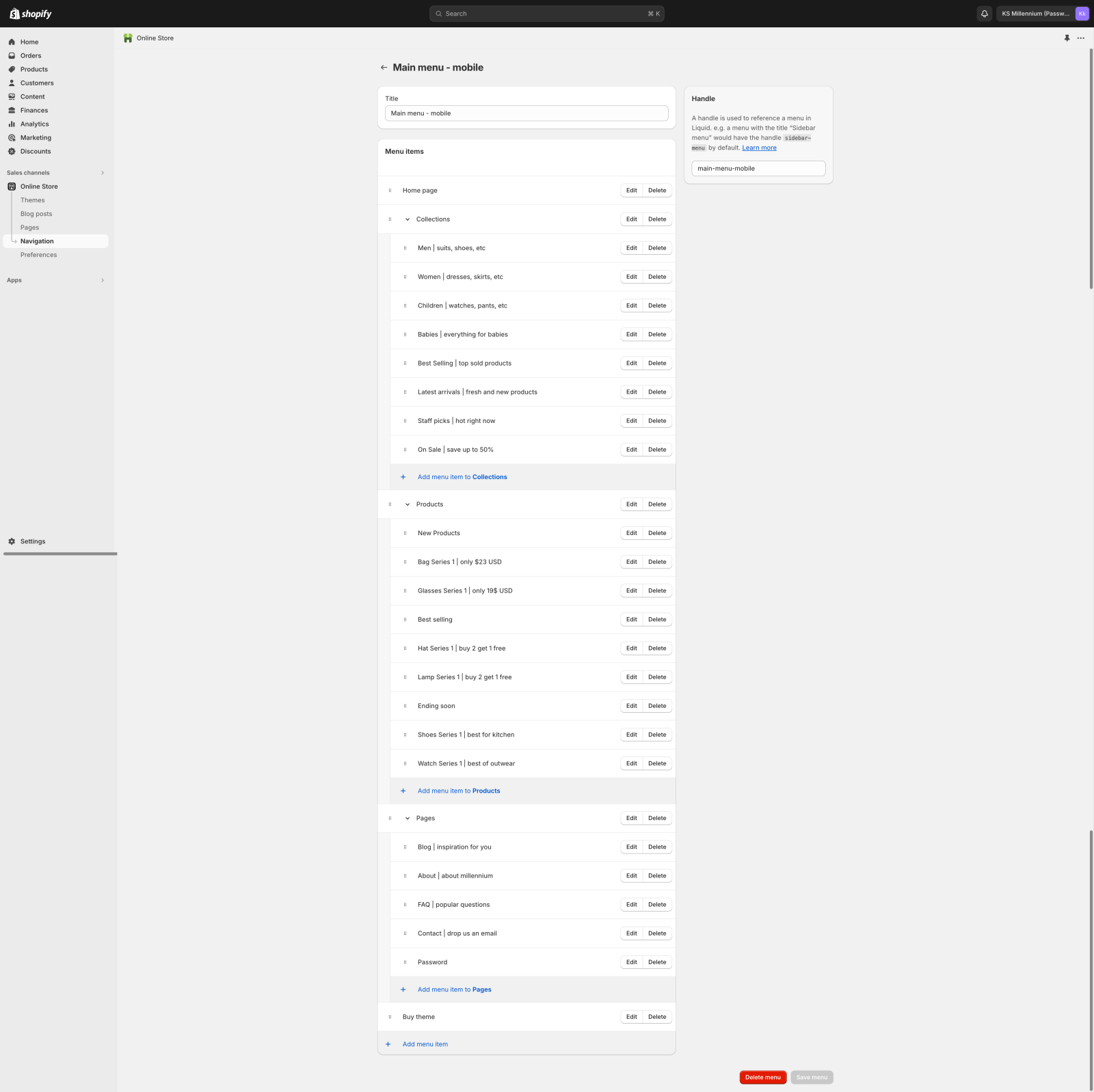
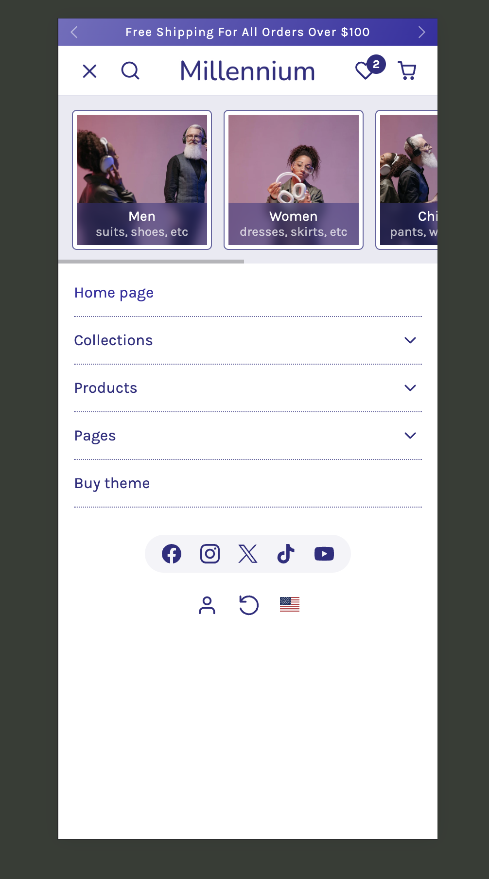
Also, please find attached two screenshots of how we have structured both menus on our demo for the KS Millennium theme.
Here are some key points to know for both menus.
- To show the megamenu on the desktop menu you need to have 3 child levels, and the dropdown will switch from a normal dropdown to a megamenu automatically (check the "Shop" menu item on the screenshot)
- To show the image on the left of the dropdown menu items along with the subtitle below you have to separate the menu items with the "|" (pipe) character.
- To show a dropdown menu item as a header (without a link), the menu link has to be only a "#" (hash) character. The menu item title can be anything.
- To have a dropdown separator (horizontal line) on the menu dropdowns the menu item link must be only a "-" (hyphen). The link can be anything but usually, we add just a "#" symbol
- To show a menu item as a button (megamenu) the link title must be separated with a "|" (pipe) character and after it should have the button class. Classes that can be used are: btn-primary, btn-light-primary, btn-outline-primary. Also instead of "primary" you may use "secondary" to use a secondary style. E.g menu item "Best selling | btn-primary"
- The mobile menu must be structured with two levels only (not three like the desktop megamenu). That's because the customers will have difficulties navigating 3 levels deep on the mobile menu.
- Feel free to let me know if you have any other questions.


